So-called Human Centred Design – design that results in a seamless user experience (UX) – is much lauded, and rightly so.
But did you know that this Fine Art can also be a Dark Art?
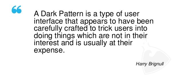
UK-based consultant Harry Brignull did a PhD in Cognitive Science and was an academic researcher when he
coined the term “Dark Patterns” to describe design tactics that encourage users to do things they otherwise wouldn’t normally do.
Think of little nudges that modify behaviour without the user necessarily realising it.
A simple example is a technique of making it look like you need to tick a box to continue with a registration form, even though the box is actually voluntary.
When you tick the box, you give permission to an organisation to market to you without realising this is not necessary and that to make it mandatory would be illegal.

Brignull has created a website – https://darkpatterns.org/ – to help people understand what to look for in order to combat such unethical design tactics.
After all, as is noted on an illustrative video on his site – https://youtu.be/kxkrdLI6e6M – design is the language which mediates our relationship with the internet.
As such, it shouldn’t be too much to ask that the use of design language be both comprehensible and honest.
